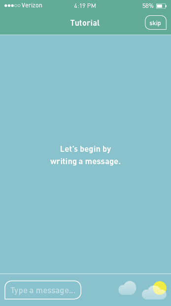
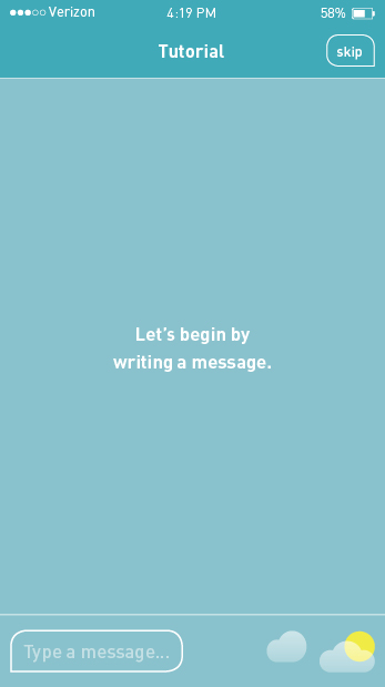
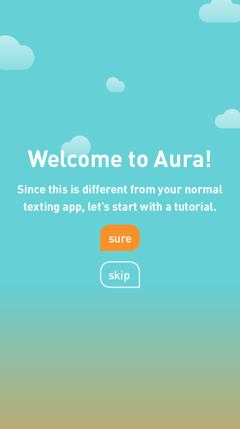
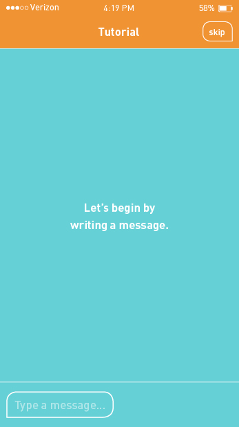
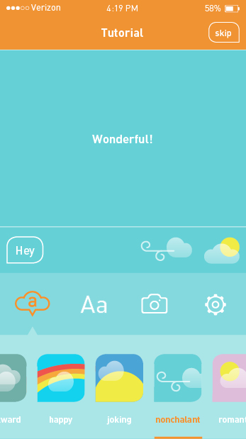
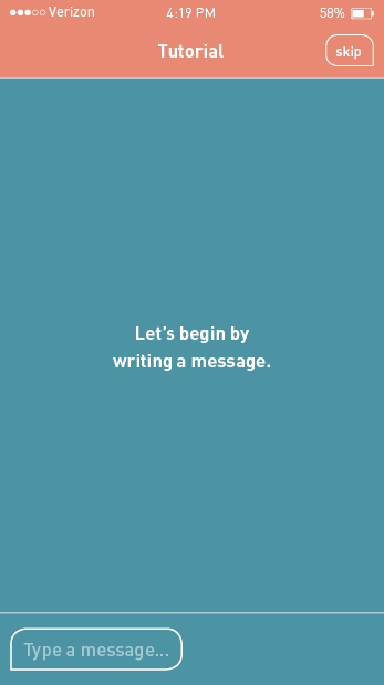
I took a semester long "break" from my thesis in order to learn about a comprehensive branding process and UI/UX game design. In the interim I also started a preliminary wireframe, sketched logo designs, designed logo roughs, and caught my research book up to speed (the process for these are coming soon). Now it's time to focus on completing Aura and roll out its branding, advertising, and marketing. I will need to do extensive user testing in order to successfully execute Aura. Here some some possible research methods:
Rapid Iterative Testing & Evaluation
With lots to do this semester, this research method will allow me to quickly spot and fix problems in wireframes and higher fidelity prototypes. Changes are made as soon as problems are identified during user testing and the updated prototypes serves as the new design direction.
Evaluative Research
As a balance to the very performance- and product-based testing of Rapid Iterative Testing & Evaluation, this research method focuses on preference measures. Subjective feedback including aesthetic and emotional responses is collected. This more humanistic emphasis is incredibly important for my project where I aim to make digital communication more humanistic. I especially intend to use this method when refining the auras.
Crowdsourcing
As I approach the high-fidelity stage of prototype, I intend to target a large group of people to get feedback. Using InVision allows me to share a link to a prototype and receive comments. I will send the link through an email blast and on social media.