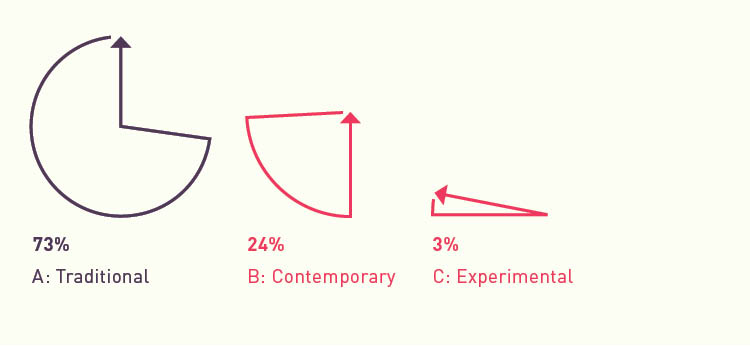
I received a total of 33 responses to the looks survey with some helpful feedback. Here are some highlights:
- Vote: A
It’s cleaner and more legible. The others don’t look as real, if that makes sense. You want to use a style that people are used to, then they’ll be more inclined to use it. You don’t want to reinvent the wheel with your thesis project. :D - Vote: A
It’s easier to see exactly what the weather means. The watercolor/sketchy look is visually appealing, but also distracting. - Vote: A
While it looks less “artsy,” it is the easiest “read.” I get the emotion quickly with the colors that convey the mood. Where as the others have me looking at the art and/or font. - Vote: A
Look C would be my second choice because of the changes in the text. - Vote: B
Look B has greater readability and cleaner execution of the water color graphics than Look C. The non-filled text box defines the text but still allows the text to be integrated with the weather mood. Look A favors the text the most but the weather moods are too cartoonish and create a more cluttered look.
Through all the experiments with staining and hand writing, it seems that my app is experimental enough that the style should be in a style that users would expect it to be in. Even though my app will have a more traditional look, the more experimental looks provided me with some insight. The outline text boxes works well visually and functionally and the animation of the text plays a large role in how the aura is interpreted.